Creating borders less than 1 pixel in CSS can be challenging, as CSS doesn’t inherently support border widths less than 1px. This is due to the way pixels are rendered on screens. Also, most browsers don’t support fractional pixel values for border widths. However, there are several techniques web developers can use to achieve the appearance of sub-pixel borders.
This article explores these methods, their pros and cons, and browser compatibility considerations
Workarounds and Alternatives
While we can’t physically create a CSS border thinner than 1px, we can use some techniques to simulate the effect:
1. Using Box Shadows
One of the most popular techniques for creating sub-pixel borders is using the box-shadow property. This method allows for fine control over the appearance and can create very thin lines.
.thin-border {
  box-shadow: 0 0 0 1px rgba(0, 0, 0, 0.1);
}
Pros:
- Allows for precise control over thickness and color
- Works well on most modern browsers
Cons:
- May not render consistently across all devices
- Can be affected by the device’s pixel density
2. Using SVG
SVG allows for more precise control over line thickness and can be a good option for creating thin borders.
<svg width="100" height="100">
  <rect width="100" height="100" fill="none" stroke="black" stroke-width="0.5"/>
</svg>
Pros:
- Highly precise and scalable
- Consistent across different devices and pixel densities
Cons:
- Requires using SVG, which may not always be suitable for all use cases
- Can be more complex to implement and style compared to pure CSS solutions
3. Use Opacity to Set CSS Borders Less Than 1px
Another technique to create the illusion of sub-pixel borders is by using a 1px border with reduced opacity. This method can make the border appear thinner than it actually is.
.thin-border {
  border: 1px solid rgba(0, 0, 0, 0.3);
}
Pros:
- Simple to implement
- Works across all browsers and devices
- Can be easily adjusted for different levels of “thinness”
Cons:
- Not a true sub-pixel border, but creates the illusion of one
- May not be suitable for all background colors or patterns
- Can look different on various display types due to color blending
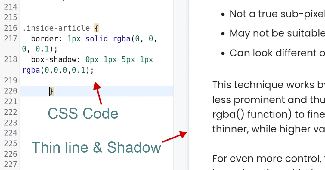
This technique works by reducing the opacity of the border color, which makes it appear less prominent and thus thinner. You can adjust the opacity value (the last number in the rgba() function) to fine-tune the appearance. Lower values will make the border appear thinner, while higher values will make it more visible.
For even more control, you can combine this technique with other methods, such as using it in conjunction with the box-shadow approach:
.thin-border {
  border: 1px solid rgba(0, 0, 0, 0.3);
  box-shadow: 0 0 0 1px rgba(0, 0, 0, 0.1);
}
This combination can create a subtle, thin border effect that works well across different devices and browsers.
Important Considerations:
- Browser Compatibility: Test your chosen method across different browsers to ensure consistent results.
- Device and Screen Resolution: The appearance of the border might vary depending on the device and screen resolution.
- Design Context: Consider the overall design and whether a truly thin border is necessary. Sometimes, a slightly thicker border might be more visually effective.
Conclusion
While CSS doesn’t officially support border widths less than 1px, these techniques provide viable alternatives for creating the appearance of thinner borders. Each method has its strengths and weaknesses, so choose the one that best fits your specific use case and browser support requirements. As web technologies continue to evolve, we may see better native support for sub-pixel borders in the future.
Frequently Asked Questions – CSS
CSS stands for Cascading Style Sheets.
CSS is a language used to describe the presentation of a document written in a markup language like HTML. In simpler terms, it’s used to style the appearance of web pages. Think of HTML as the foundation of a house (defining its structure), and CSS as the interior design (controlling its look and feel).
CSS works alongside HTML to style web content. You can embed CSS directly within an HTML document, link to an external CSS file, or even use inline styles within specific HTML tags.
You can set the border color using color names (e.g., red, blue), hexadecimal values (e.g., #ff0000), RGB values (e.g., rgb(255, 0, 0)), or HSL values.
You can create rounded corners using the border-radius property. This property allows you to specify the radius of the corners, creating a softer, more visually appealing look.
border and outline in CSS? While both border and outline create lines around an element, there’s a key difference:
– border: The border is considered part of the element’s dimensions and affects the layout.
– outline: The outline is drawn outside the element’s dimensions and doesn’t affect the layout.
Sometimes you need subtle dividers or delicate lines for a clean design. Think hairlines between table cells, subtle outlines on buttons, or faint separators in a navigation menu.

